
- What are Employee Segments?
- Anonymity of Segment Results
- Using the Heatmap to Compare Segments
- Comparing Segments to Overall Company Score
- Comparing Segment Trends Over Time
What are Employee Segments?
Employee segmentation allows you to slice and dice the analysis from Perked! to give you detailed breakdowns of how and why areas of your organization differ from one another.
A Segment is a group of employees defined by your organization’s structure (e.g. team, department, office, role/position) or demographics (e.g. tenure, age).
Segmentation is a great way to compare the engagement and driver scores between your teams, departments, offices, locations or tenure groups (as an example).
This can be done at a company-level or segment-level. What's the difference? Here are examples to illustrate.
- Company-level: Compare the Marketing Team to the Engineering Team.
- Segment-level (aka "Segment within a Segment"): In the Marketing Team, compare new employees (0 to 3 months) to more tenured employees (5+ years).
The Heatmap is the best way to view segmented results.
Anonymity of Segment Results
Only those segments that meet the anonymity requirements will be displayed.
Using the Heatmap report to Compare Segments
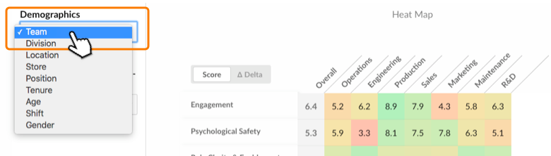
The Heatmap is accessible via the navigation bar of your dashboard. Then, using the "Segments" drop down menu, select the segment that you want to see.
Comparing Segments to Overall Company Score
Compare segment scores to overall company score by switching to the "Delta"-view using the toggle button.
Comparison to the overall company score allows you to identify "hotspots" in your company. Segments that are not doing as well as your company average represent potential focus areas to drive improvements. On the flip side, you can also identify segments that are doing better than the company average and celebrate these successes.
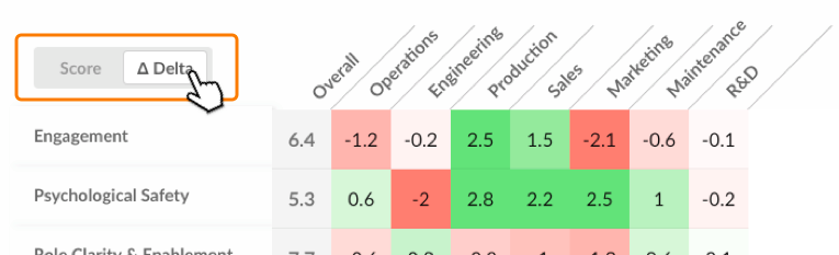
On the Heatmap, the number you see represents:
Delta = Segment Score – Company Score

Comparing Segment Trends Over Time
You can also compare current segment scores to previous survey round scores by using the “Compare Now To” drop down menu. To make it easy for you, we've preset the options for trend comparison to three, six, nine or twelve months ago.
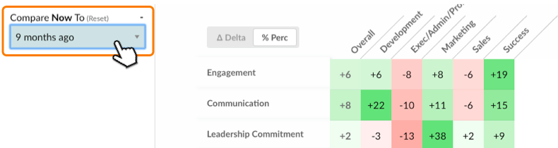
Using the toggle button you have the option of seeing the change in score as a "score difference" (toggle to "Delta") or as a “percentage difference” (toggle to "% Perc"). In addition, when you hover your mouse on the heatmap grid a popup will appear showing you the details of the calculation.